Back when i took my first Illustrator class, my goal was to do a new logo for Fife Photography. Finally, I’m working on it!
So with a whole new state and client el, we’re going to have a whole new look. We’re working on our branding, and i want your opinion!
This is my favorite logo so far,

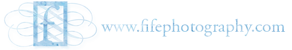
And this is what it looks like with our name…

But a calligrapher gave me advice to have it more asymmetrical. What do you think?

Ooooh. Awesome. Can you show us the second logo with the name as well? I kinda think I agree with the calligrapher. But they’re both fabulous! 🙂
asymmetrical for sure. It’s awesome!
I really like the original one, and then I saw the asymmetrical one and liked that even better. I looked really hard for some feedback and the only thing I could think of was where the “I” in fife and the “H” in photography meet. from my tiny screen it looks like they touch slightly but aren’t completely together. Maybe combine the serifs by moving it up slightly? and the more I look at it it might already be together but my screen is so small! Colors are great!
I love the first one!!!